
Almost all Magento users nowadays apply Magento responsive templates for their websites as they are perfectly fit on any screen size, namely, desktop, mobile, tablet, etc.
As a result, businesses don’t have to find many templates for every single device. It can be automatically compatible whenever you visit the site by any device.
So, what can a responsive template help for your store? This question will be answered in this article. Also, we will provide a list of best tips and tutorials for a Magento responsive template.
Table of Contents
Why Should You Use A Responsive Website?

A responsive template is now familiar to online store owners, especially Magento users. However, some still maintain the old ways of designing 2 different themes and it seems unnecessary.
We will change your mind with this section. These are importances of a responsive template that you should know.
#1. Optimal on Any Device, Especially Mobile
 According to Statista, the number of smartphone users was over 3.2 billion in 2019 and kept increasing day by day. Also, about 70% – 80% of searches are from mobile devices. Therefore, if you want to drive traffic to your store, do it now.
We have to note that a responsive website is different from a mobile-friendly one. While the former is compatible with all devices, the latter is used only for mobile. So please don’t be confused and choose the right one for you.
#2. Create The Best Customer’s Experience

This is the most beneficial point as we always want customers to have the best purchasing process when visiting our websites. Thenceforth, we can boost sales and generate conversion rates quickly.
Just imagine your website is unresponsive, the image is not fit with the device, the information is not in the right places and they have to scroll horizontally over and over again. In such cases, the customers will definitely say goodbye to your store.
#3. Cost Reduction & Less Time Consuming
 Having 2 templates, you will have to double the maintenance costs for your website. But now, you have another option to reduce the cost. For this reason, it is much better when using just 1 template for all, isn’t it?
Also, creating 2 separate themes leads to time-consuming as you have to wait for the building process and the maintenance services for both.
#4. Good for SEO Performance
 It is true. Because of a change in the Google algorithm, a responsive website will be likely to show up on search engines more than an unresponsive one.
In particular, when your website is mobile-friendly, you can keep customers stay longer in your store. As a result, your SEO efforts will be improved.
Best Tips for A Responsive Template
After understanding the importance, let’s come to several tips to create the best responsive website.
Tip #1: Always Plan The Design Before Anything Else
 Preparation is always an essential step in any process.
Before actually designing the website, you have to have the ideas in mind. Please think of the color, the layout, the voice tone. Also, researching the competitor’s websites is necessary as you can create your differentiation.
Besides, you should have a specific strategy for your website development, not only in designing but also the whole running progress, as well.
Tip #2: Keep Your Design Simple

As studied by Google, people always prefer using simple websites to complex ones.
Especially on a small screen such as a smartphone, an interface with a lot of details will distract and confuse customers. Hence, you need to cut down unnecessary information and images on your website.
Moreover, please avoid long paragraphs, large images, and auto-play videos. They are not suitable for mobile devices.
Tip #3: Optimize Things for Mobile
 Things we mentioned here are buttons, typographic.
As the mobile screen is quite small, all the buttons, such as add to cart, buy, payment, etc., need to be big enough to emphasize. Or, in another way, you can make the button appear everywhere on your pages, including homepage and subpages.
Also, you need to make sure that the font is easy to read, and the size is big enough on every device.
Tip #4: Understand Principals
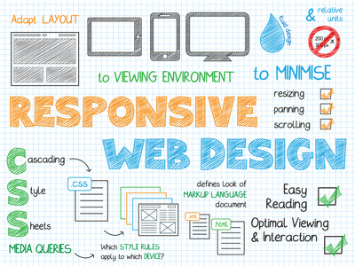 Such principals we are talking about are fluid grids, media queries, and flexible images. All of them we have explained in another review. Please click on the link below for more information.
Tip #5: Use Pre-made Magento Responsive Templates
Instead of designing on your own, you can use existing responsive templates for your website. They are relatively easy to use themes and include many layouts suitable for devices.
Want to find free Magento responsive templates? No problem!
On BSS Themes, we have already provided a review on Magento responsive template, free & paid options. You can click to find out more and find a suitable one for you.
Tip #6: Check Whether Your Site Is Responsive Or Not
You can check the responsiveness of your website on several online tools:
- Google Mobile-friendly Test: This is a useful tool developed by Google. Just simply enter the URL in the box, and you can get the result in seconds.
- Responsive Design Checker: This is an interesting tool for you. The result coming out will show you the designs on every single device, in all sizes.
- Mobile Test: Before checking, you can choose to show the website design on what kind of mobile device.
How to Create A Responsive Mobile Template Based on Default Theme?
This section will help to create a responsive mobile theme using default Magento approaches in 2 simple steps:
Step 1: Create A Mobile-specific Theme
In this step, you need to declare the Blank or Luma theme as a parent theme.
Then, add a <theme_dir>/Magento_theme/layout/default_head_blocks.xml layout file.
Step 2: Apply Mobile-specific styles
To generate mobile styles, please use style-m.less commands.
Several media queries, such as @media_common, max screen__m, max @screen__xs, and max @screen__xxs will be added to styles-m.css.
For detailed tutorials, please click here to find out.
Conclusion
To sum up, a responsive website is now a must for any e-commerce business. Therefore, you need to pay attention to create the best experience for customers.
We hope that this article will give you a clear overview of the Magento responsive template. As a result, you will realize the importance of this kind of theme.
If you need further information, please don’t hesitate to comment in the section below. We are glad to hear from you.
Thanks a lot for reading!